Free Statistics

of Irreproducible Research!

Author's title

Author*The author of this computation has been verified*
R Software Modulerwasp_meanplot.wasp
Title produced by softwareMean Plot
Date of computationWed, 05 Nov 2008 13:49:34 -0700
Cite this page as followsStatistical Computations at FreeStatistics.org, Office for Research Development and Education, URL https://freestatistics.org/blog/index.php?v=date/2008/Nov/05/t1225918298ry38nuo5xb9bszc.htm/, Retrieved Mon, 20 May 2024 11:20:38 +0000
Statistical Computations at FreeStatistics.org, Office for Research Development and Education, URL https://freestatistics.org/blog/index.php?pk=21941, Retrieved Mon, 20 May 2024 11:20:38 +0000
QR Codes:

Original text written by user:
IsPrivate?No (this computation is public)
User-defined keywordshundrasmet
Estimated Impact158
Family? (F = Feedback message, R = changed R code, M = changed R Module, P = changed Parameters, D = changed Data)
F     [Mean Plot] [workshop 3] [2007-10-26 12:14:28] [e9ffc5de6f8a7be62f22b142b5b6b1a8]
F R PD  [Mean Plot] [workshop 1 task 1 Q2] [2008-11-05 19:25:29] [923dc41d40e6465538c66cadc847dd5d]
F R P       [Mean Plot] [workshop 1 task 4 Q2] [2008-11-05 20:49:34] [fb0a4305582623ea5408efbbf6f8b708] [Current]
Feedback Forum
2008-11-10 14:08:36 [Jan Van den Keybus] [reply
Ik zou de conclusie wat uitbreiden. Wanneer alle gegevens worden gebruikt (zie task 1), kunnen we een piek waarnemen rond maand 7 en een dal in maand 6. Wanneer men de hoogste en laagste 5% weglaat (task 4), zien we duidelijk dat de omgekeerde gebeurt. In maand 6 kunnen we nu van een piek spreken en in maand 7 van een dal. Er doen zich in de andere maanden ook opvallende verschillen voor. Wat ook opvalt is dat de notched boxplots elkaar hier bijna allemaal overlappen, zodat men niet echt kan spreken van significante verschillen, en dus ook niet echt van seizoenaliteit. We zouden dus eerder kunnen zeggen op basis van deze grafiek dat de seizoenaliteit niet zo’n grote rol speelt, wanneer de hoogste en laagste vijf procent van de gegevens weggelaten wordt.
2008-11-10 17:37:48 [Hundra Smet] [reply
wat Jan zegt klopt inderdaad, dit heb ik zelf niet kunnen concluderen wanneer ik vorige week de oefening maakte. nu kan ik enkel dit nog toevoegen:

de conclusie ontbreekt (plots zijn wel juist). deze is: de spreiding wordt kleiner omdat je de 5% kleinste observaties en de 5% grootste observaties weglaat. hierdoor zijn er minder outliers (door wegvallen hoogste en laagste extreme waarden)
2008-11-12 09:45:29 [Stef Vermeiren] [reply
door de eerste en laatste 5% van de metingen weg te laten, wordt de spreiding kleiner waardoor de outliers weggefilterd worden.
2008-11-12 10:22:10 [407693b66d7f2e0b350979005057872d] [reply
Plots zijn correct maar conclusie ontbreekt.

De spreiding gaat kleiner worden omdat je de 5% kleinste observaties en de 5% grootste observaties gaat weglaten. Er gaan zich dus veel minder outliers voordoen omdat er meer extreme waarden worden weggelaten


Post a new message
Dataseries X:
109.20
88.60
94.30
98.30
86.40
80.60
104.10
108.20
93.40
71.90
94.10
94.90
96.40
91.10
84.40
86.40
88.00
75.10
109.70
103.00
82.10
68.00
96.40
94.30
90.00
88.00
76.10
82.50
81.40
66.50
97.20
94.10
80.70
70.50
87.80
89.50
99.60
84.20
75.10
92.00
80.80
73.10
99.80
90.00
83.10
72.40
78.80
87.30
91.00
80.10
73.60
86.40
74.50
71.20
92.40
81.50
85.30
69.90
84.20
90.70
100.30


Summary of computational transaction
Raw Inputview raw input (R code)
Raw Outputview raw output of R engine
Computing time3 seconds
R Server'George Udny Yule' @ 72.249.76.132

\begin{tabular}{lllllllll}
\hline
Summary of computational transaction \tabularnewline
Raw Input & view raw input (R code)  \tabularnewline
Raw Output & view raw output of R engine  \tabularnewline
Computing time & 3 seconds \tabularnewline
R Server & 'George Udny Yule' @ 72.249.76.132 \tabularnewline
\hline
\end{tabular}
%Source: https://freestatistics.org/blog/index.php?pk=21941&T=0

[TABLE]
[ROW][C]Summary of computational transaction[/C][/ROW]
[ROW][C]Raw Input[/C][C]view raw input (R code) [/C][/ROW]
[ROW][C]Raw Output[/C][C]view raw output of R engine [/C][/ROW]
[ROW][C]Computing time[/C][C]3 seconds[/C][/ROW]
[ROW][C]R Server[/C][C]'George Udny Yule' @ 72.249.76.132[/C][/ROW]
[/TABLE]
Source: https://freestatistics.org/blog/index.php?pk=21941&T=0

Globally Unique Identifier (entire table): ba.freestatistics.org/blog/index.php?pk=21941&T=0

As an alternative you can also use a QR Code:  

The GUIDs for individual cells are displayed in the table below:

Summary of computational transaction
Raw Inputview raw input (R code)
Raw Outputview raw output of R engine
Computing time3 seconds
R Server'George Udny Yule' @ 72.249.76.132


Parameters (Session):
par1 = 12 ;
Parameters (R input):
par1 = 12 ;
R code (references can be found in the software module):
par1 <- as.numeric(par1)
(n <- length(x))
(np <- floor(n / par1))
arr <- array(NA,dim=c(par1,np+1))
darr <- array(NA,dim=c(par1,np+1))
ari <- array(0,dim=par1)
dx <- diff(x)
j <- 0
for (i in 1:n)
{
j = j + 1
ari[j] = ari[j] + 1
arr[j,ari[j]] <- x[i]
darr[j,ari[j]] <- dx[i]
if (j == par1) j = 0
}
ari
arr
darr
arr.mean <- array(NA,dim=par1)
arr.median <- array(NA,dim=par1)
arr.midrange <- array(NA,dim=par1)
for (j in 1:par1)
{
arr.mean[j] <- mean(arr[j,],na.rm=TRUE)
arr.median[j] <- median(arr[j,],na.rm=TRUE)
arr.midrange[j] <- (quantile(arr[j,],0.75,na.rm=TRUE) + quantile(arr[j,],0.25,na.rm=TRUE)) / 2
}
overall.mean <- mean(x)
overall.median <- median(x)
overall.midrange <- (quantile(x,0.75) + quantile(x,0.25)) / 2
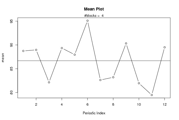
bitmap(file='plot1.png')
plot(arr.mean,type='b',ylab='mean',main='Mean Plot',xlab='Periodic Index')
mtext(paste('#blocks = ',np))
abline(overall.mean,0)
dev.off()
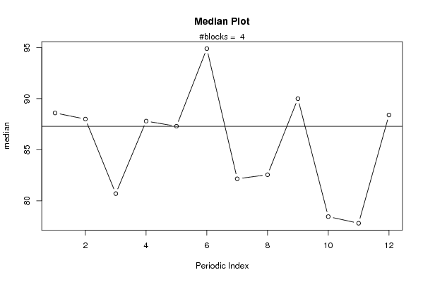
bitmap(file='plot2.png')
plot(arr.median,type='b',ylab='median',main='Median Plot',xlab='Periodic Index')
mtext(paste('#blocks = ',np))
abline(overall.median,0)
dev.off()
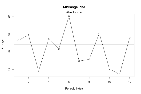
bitmap(file='plot3.png')
plot(arr.midrange,type='b',ylab='midrange',main='Midrange Plot',xlab='Periodic Index')
mtext(paste('#blocks = ',np))
abline(overall.midrange,0)
dev.off()
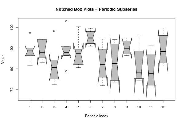
bitmap(file='plot4.png')
z <- data.frame(t(arr))
names(z) <- c(1:par1)
(boxplot(z,notch=TRUE,col='grey',xlab='Periodic Index',ylab='Value',main='Notched Box Plots - Periodic Subseries'))
dev.off()
bitmap(file='plot4b.png')
z <- data.frame(t(darr))
names(z) <- c(1:par1)
(boxplot(z,notch=TRUE,col='grey',xlab='Periodic Index',ylab='Value',main='Notched Box Plots - Differenced Periodic Subseries'))
dev.off()
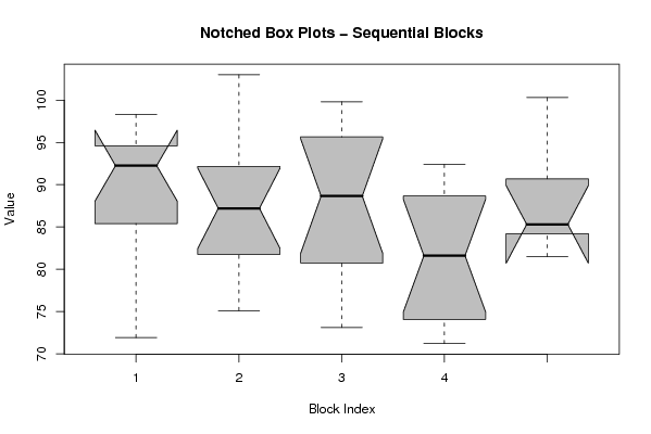
bitmap(file='plot5.png')
z <- data.frame(arr)
names(z) <- c(1:np)
(boxplot(z,notch=TRUE,col='grey',xlab='Block Index',ylab='Value',main='Notched Box Plots - Sequential Blocks'))
dev.off()
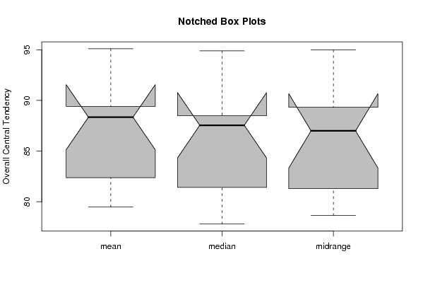
bitmap(file='plot6.png')
z <- data.frame(cbind(arr.mean,arr.median,arr.midrange))
names(z) <- list('mean','median','midrange')
(boxplot(z,notch=TRUE,col='grey',ylab='Overall Central Tendency',main='Notched Box Plots'))
dev.off()