The goal of spuriouscorrelations is to keep alive the amazing examples from Tyler Vigen. Unfortunately, as of 2023-10-09, the website is down as my students noticed. Therefore, I decided to use the snapshot from the Internet Wayback Machine to save the datasets from 2023-06-07.
You can install the CRAN version of spuriouscorrelations with:
install.packages("spuriouscorrelations")You can install the development version of spuriouscorrelations with:
remotes::install_github("pachadotdev/spuriouscorrelations")The package covers multiple examples for different spurious (and curious) correlations.
Here is a basic example which shows you how to plot a spurious correlation for the variables
library(spuriouscorrelations)
library(tinyplot)

pool_drownings

#    year   x y
# 1  1999 109 2
# 2  2000 102 2
# 3  2001 102 2
# 4  2002  98 3
# 5  2003  85 1
# 6  2004  95 1
# 7  2005  96 2
# 8  2006  98 3
# 9  2007 123 4
# 10 2008  94 1
# 11 2009 102 4

cor(pool_drownings$x, pool_drownings$y)

# [1] 0.6660043

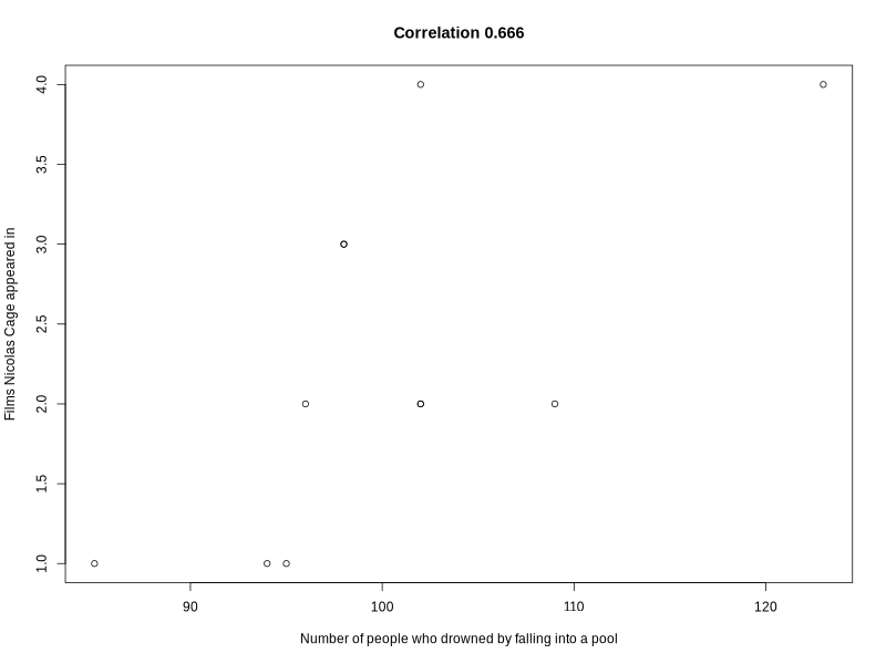
tinyplot(
  y ~ x,
  data = pool_drownings,
  main = sprintf("Correlation %s", round(cor(pool_drownings$x, pool_drownings$y), 3)),
  xlab = "Number of people who drowned by falling into a pool",
  ylab = "Films Nicolas Cage appeared in"
)
Converting the data to long format simplified plotting both variables per year:
pool_drownings_2 <- reshape(
  pool_drownings,
  varying = c("x", "y"),  # columns to collapse
  v.names = "value",      # name of the new value column
  timevar = "variable",   # name of the new ID column
  times = c("x", "y"),    # values to populate the ID column
  direction = "long"      # target format
)

pool_drownings_2

#      year variable value id
# 1.x  1999        x   109  1
# 2.x  2000        x   102  2
# 3.x  2001        x   102  3
# 4.x  2002        x    98  4
# 5.x  2003        x    85  5
# 6.x  2004        x    95  6
# 7.x  2005        x    96  7
# 8.x  2006        x    98  8
# 9.x  2007        x   123  9
# 10.x 2008        x    94 10
# 11.x 2009        x   102 11
# 1.y  1999        y     2  1
# 2.y  2000        y     2  2
# 3.y  2001        y     2  3
# 4.y  2002        y     3  4
# 5.y  2003        y     1  5
# 6.y  2004        y     1  6
# 7.y  2005        y     2  7
# 8.y  2006        y     3  8
# 9.y  2007        y     4  9
# 10.y 2008        y     1 10
# 11.y 2009        y     4 11

tinyplot(
  value ~ year | variable, # "|" indicates the groping variable for the legend
  data = pool_drownings_2,
  main = sprintf("Correlation %s", round(cor(pool_drownings$x, pool_drownings$y), 3)),
  xlab = "Year",
  ylab = "Pooled observations",
  pch = 19 # solid dot shape
)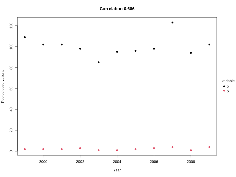
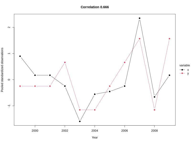
How about standarzing the variables to avoid the different scale visibility issue?
pool_drownings_3 <- pool_drownings

pool_drownings_3$x <- (pool_drownings_3$x - mean(pool_drownings_3$x)) / sd(pool_drownings_3$x)
pool_drownings_3$y <- (pool_drownings_3$y - mean(pool_drownings_3$y)) / sd(pool_drownings_3$y)

pool_drownings_3 <- reshape(
  pool_drownings_3,
  varying = c("x", "y"),  # columns to collapse
  v.names = "value",      # name of the new value column
  timevar = "variable",   # name of the new ID column
  times = c("x", "y"),    # values to populate the ID column
  direction = "long"      # target format
)

pool_drownings_3

#      year variable      value id
# 1.x  1999        x  0.8952867  1
# 2.x  2000        x  0.1696333  2
# 3.x  2001        x  0.1696333  3
# 4.x  2002        x -0.2450258  4
# 5.x  2003        x -1.5926679  5
# 6.x  2004        x -0.5560201  6
# 7.x  2005        x -0.4523554  7
# 8.x  2006        x -0.2450258  8
# 9.x  2007        x  2.3465935  9
# 10.x 2008        x -0.6596849 10
# 11.x 2009        x  0.1696333 11
# 1.y  1999        y -0.2470999  1
# 2.y  2000        y -0.2470999  2
# 3.y  2001        y -0.2470999  3
# 4.y  2002        y  0.6589330  4
# 5.y  2003        y -1.1531327  5
# 6.y  2004        y -1.1531327  6
# 7.y  2005        y -0.2470999  7
# 8.y  2006        y  0.6589330  8
# 9.y  2007        y  1.5649658  9
# 10.y 2008        y -1.1531327 10
# 11.y 2009        y  1.5649658 11

tinyplot(
  value ~ year | variable, # "|" indicates the groping variable for the legend
  data = pool_drownings_3,
  main = sprintf("Correlation %s", round(cor(pool_drownings$x, pool_drownings$y), 3)),
  xlab = "Year",
  ylab = "Pooled standardized observations",
  pch = 19, # solid dot shape
  type = "b" # add line to see the trend clearly
)