Free Statistics
of Irreproducible Research!
Description of Statistical Computation | |||||||||||||||||||||||||||||||||||||||||||||
|---|---|---|---|---|---|---|---|---|---|---|---|---|---|---|---|---|---|---|---|---|---|---|---|---|---|---|---|---|---|---|---|---|---|---|---|---|---|---|---|---|---|---|---|---|---|
| Author's title | |||||||||||||||||||||||||||||||||||||||||||||
| Author | *The author of this computation has been verified* | ||||||||||||||||||||||||||||||||||||||||||||
| R Software Module | rwasp_bidensity.wasp | ||||||||||||||||||||||||||||||||||||||||||||
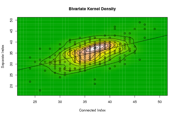
| Title produced by software | Bivariate Kernel Density Estimation | ||||||||||||||||||||||||||||||||||||||||||||
| Date of computation | Fri, 08 Oct 2010 13:51:26 +0000 | ||||||||||||||||||||||||||||||||||||||||||||
| Cite this page as follows | Statistical Computations at FreeStatistics.org, Office for Research Development and Education, URL https://freestatistics.org/blog/index.php?v=date/2010/Oct/08/t1286545818w3xrtnk0rgvgizg.htm/, Retrieved Wed, 02 Jul 2025 18:11:53 +0000 | ||||||||||||||||||||||||||||||||||||||||||||
| Statistical Computations at FreeStatistics.org, Office for Research Development and Education, URL https://freestatistics.org/blog/index.php?pk=82010, Retrieved Wed, 02 Jul 2025 18:11:53 +0000 | |||||||||||||||||||||||||||||||||||||||||||||
| QR Codes: | |||||||||||||||||||||||||||||||||||||||||||||
|
| |||||||||||||||||||||||||||||||||||||||||||||
| Original text written by user: | |||||||||||||||||||||||||||||||||||||||||||||
| IsPrivate? | No (this computation is public) | ||||||||||||||||||||||||||||||||||||||||||||
| User-defined keywords | |||||||||||||||||||||||||||||||||||||||||||||
| Estimated Impact | 261 | ||||||||||||||||||||||||||||||||||||||||||||
Tree of Dependent Computations | |||||||||||||||||||||||||||||||||||||||||||||
| Family? (F = Feedback message, R = changed R code, M = changed R Module, P = changed Parameters, D = changed Data) | |||||||||||||||||||||||||||||||||||||||||||||
| F [Bivariate Kernel Density Estimation] [Connected vs Sepa...] [2010-10-04 07:40:49] [b98453cac15ba1066b407e146608df68] F [Bivariate Kernel Density Estimation] [Connected vs Sepa...] [2010-10-08 13:51:26] [18ef3d986e8801a4b28404e69e5bf56b] [Current] | |||||||||||||||||||||||||||||||||||||||||||||
| Feedback Forum | |||||||||||||||||||||||||||||||||||||||||||||
Post a new message | |||||||||||||||||||||||||||||||||||||||||||||
Dataset | |||||||||||||||||||||||||||||||||||||||||||||
| Dataseries X: | |||||||||||||||||||||||||||||||||||||||||||||
34 33 29 34 32 35 41 27 40 40 36 40 43 40 33 37 32 26 36 39 38 34 35 41 42 36 39 33 33 36 37 36 34 32 35 39 30 25 29 39 31 26 28 40 32 35 32 41 34 36 38 34 32 34 32 40 43 35 45 36 39 31 36 36 37 40 35 36 32 36 37 42 37 36 36 33 37 35 37 28 33 45 38 43 37 36 40 39 43 32 37 34 44 35 34 37 40 36 44 35 34 40 34 39 36 40 37 35 45 39 39 37 38 46 37 27 33 42 33 33 33 38 37 35 33 39 38 39 38 30 43 34 39 36 32 37 42 40 35 39 34 28 30 36 31 34 33 37 40 39 42 47 38 38 40 37 29 37 37 33 31 36 37 39 35 33 37 42 31 32 36 32 40 32 30 37 42 37 47 37 31 41 44 40 37 33 35 40 38 36 36 35 30 37 43 33 39 38 40 29 35 37 26 28 38 29 35 38 39 44 33 35 42 30 36 40 39 36 37 37 37 36 30 32 35 42 41 35 33 39 34 39 41 34 30 29 33 40 32 37 37 36 41 34 38 40 42 32 40 38 35 34 38 24 39 42 44 35 37 34 41 33 42 30 30 40 49 39 29 39 35 35 34 24 47 24 30 34 41 32 32 35 37 40 45 35 39 46 33 40 35 38 36 34 30 44 37 36 37 34 43 31 34 38 38 34 26 36 35 37 40 43 29 30 36 38 43 41 31 36 44 35 42 31 38 34 40 41 30 43 | |||||||||||||||||||||||||||||||||||||||||||||
| Dataseries Y: | |||||||||||||||||||||||||||||||||||||||||||||
30 28 31 35 35 37 39 31 38 37 37 35 37 42 28 37 36 37 33 40 30 36 33 40 37 37 39 35 36 34 36 32 33 27 37 32 31 31 32 37 25 30 37 37 40 35 35 43 32 42 35 27 30 31 36 36 41 34 36 33 35 28 33 38 37 39 34 32 36 36 35 33 42 36 33 36 32 35 38 33 32 38 39 39 39 30 38 38 42 41 31 39 40 31 34 23 28 36 41 29 31 33 35 35 34 40 34 36 35 39 33 37 40 32 37 27 35 37 32 31 31 38 34 30 34 37 38 33 35 27 34 35 39 35 34 36 36 32 39 40 35 31 35 38 37 31 32 35 39 31 39 48 33 36 40 37 34 42 39 28 26 30 30 39 37 40 38 35 33 34 33 41 36 27 33 38 31 31 46 33 34 47 36 38 32 33 34 34 37 37 41 27 31 38 30 36 30 34 32 29 29 39 32 30 39 30 40 41 38 37 33 34 36 39 41 42 38 40 32 40 37 36 28 36 35 32 38 32 39 39 31 33 46 38 24 28 35 39 37 38 38 32 36 28 38 28 37 28 40 34 33 32 30 33 37 39 42 36 35 32 35 33 36 31 32 38 46 39 31 39 36 37 33 22 42 28 28 31 36 37 35 31 37 38 46 40 43 49 39 37 36 31 32 38 37 36 21 32 36 35 39 28 42 36 41 30 18 37 28 39 40 44 26 34 37 37 32 29 31 32 44 39 39 35 36 33 35 35 30 38 | |||||||||||||||||||||||||||||||||||||||||||||
Tables (Output of Computation) | |||||||||||||||||||||||||||||||||||||||||||||
| |||||||||||||||||||||||||||||||||||||||||||||
Figures (Output of Computation) | |||||||||||||||||||||||||||||||||||||||||||||
Input Parameters & R Code | |||||||||||||||||||||||||||||||||||||||||||||
| Parameters (Session): | |||||||||||||||||||||||||||||||||||||||||||||
| par1 = 50 ; par2 = 50 ; par3 = 0 ; par4 = 0 ; par5 = 0 ; par6 = Y ; par7 = Y ; | |||||||||||||||||||||||||||||||||||||||||||||
| Parameters (R input): | |||||||||||||||||||||||||||||||||||||||||||||
| par1 = 50 ; par2 = 50 ; par3 = 0 ; par4 = 0 ; par5 = 0 ; par6 = Y ; par7 = Y ; | |||||||||||||||||||||||||||||||||||||||||||||
| R code (references can be found in the software module): | |||||||||||||||||||||||||||||||||||||||||||||
par1 <- as(par1,'numeric') | |||||||||||||||||||||||||||||||||||||||||||||