Free Statistics
of Irreproducible Research!
Description of Statistical Computation | |||||||||||||||||||||||||||||||||||||||||||||
|---|---|---|---|---|---|---|---|---|---|---|---|---|---|---|---|---|---|---|---|---|---|---|---|---|---|---|---|---|---|---|---|---|---|---|---|---|---|---|---|---|---|---|---|---|---|
| Author's title | |||||||||||||||||||||||||||||||||||||||||||||
| Author | *The author of this computation has been verified* | ||||||||||||||||||||||||||||||||||||||||||||
| R Software Module | rwasp_bidensity.wasp | ||||||||||||||||||||||||||||||||||||||||||||
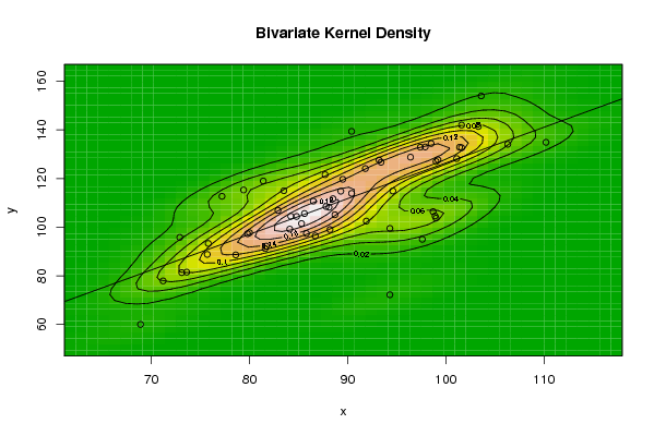
| Title produced by software | Bivariate Kernel Density Estimation | ||||||||||||||||||||||||||||||||||||||||||||
| Date of computation | Tue, 11 Nov 2008 07:13:42 -0700 | ||||||||||||||||||||||||||||||||||||||||||||
| Cite this page as follows | Statistical Computations at FreeStatistics.org, Office for Research Development and Education, URL https://freestatistics.org/blog/index.php?v=date/2008/Nov/11/t1226412866i91q49i0ipbpqse.htm/, Retrieved Fri, 11 Jul 2025 05:20:11 +0000 | ||||||||||||||||||||||||||||||||||||||||||||
| Statistical Computations at FreeStatistics.org, Office for Research Development and Education, URL https://freestatistics.org/blog/index.php?pk=23498, Retrieved Fri, 11 Jul 2025 05:20:11 +0000 | |||||||||||||||||||||||||||||||||||||||||||||
| QR Codes: | |||||||||||||||||||||||||||||||||||||||||||||
|
| |||||||||||||||||||||||||||||||||||||||||||||
| Original text written by user: | |||||||||||||||||||||||||||||||||||||||||||||
| IsPrivate? | No (this computation is public) | ||||||||||||||||||||||||||||||||||||||||||||
| User-defined keywords | |||||||||||||||||||||||||||||||||||||||||||||
| Estimated Impact | 240 | ||||||||||||||||||||||||||||||||||||||||||||
Tree of Dependent Computations | |||||||||||||||||||||||||||||||||||||||||||||
| Family? (F = Feedback message, R = changed R code, M = changed R Module, P = changed Parameters, D = changed Data) | |||||||||||||||||||||||||||||||||||||||||||||
| F [Notched Boxplots] [workshop 3] [2007-10-26 13:31:48] [e9ffc5de6f8a7be62f22b142b5b6b1a8] F RMPD [Mean Plot] [workshop 4 deel 1...] [2008-10-31 09:40:26] [077ffec662d24c06be4c491541a44245] F [Mean Plot] [] [2008-11-01 13:19:15] [4c8dfb519edec2da3492d7e6be9a5685] F D [Mean Plot] [] [2008-11-01 14:24:03] [4c8dfb519edec2da3492d7e6be9a5685] F RMPD [Star Plot] [Star Plot - Bob L...] [2008-11-02 16:44:14] [57850c80fd59ccfb28f882be994e814e] F RMPD [Bivariate Kernel Density Estimation] [Q1-1] [2008-11-11 14:13:42] [541f63fa3157af9df10fc4d202b2a90b] [Current] | |||||||||||||||||||||||||||||||||||||||||||||
| Feedback Forum | |||||||||||||||||||||||||||||||||||||||||||||
Post a new message | |||||||||||||||||||||||||||||||||||||||||||||
Dataset | |||||||||||||||||||||||||||||||||||||||||||||
| Dataseries X: | |||||||||||||||||||||||||||||||||||||||||||||
81,6 84,1 88,1 85,3 82,9 84,8 71,2 68,9 94,3 97,6 85,6 91,9 75,8 79,8 99 88,5 86,7 97,9 94,3 72,9 91,8 93,2 86,5 98,9 77,2 79,4 90,4 81,4 85,8 103,6 73,6 75,7 99,2 88,7 94,6 98,7 84,2 87,7 103,3 88,2 93,4 106,3 73,1 78,6 101,6 101,4 98,5 99 89,5 83,5 97,4 87,8 90,4 101,6 80 81,7 96,4 110,2 101,1 89,3 | |||||||||||||||||||||||||||||||||||||||||||||
| Dataseries Y: | |||||||||||||||||||||||||||||||||||||||||||||
91,2 99,2 108,2 101,5 106,9 104,4 77,9 60 99,5 95 105,6 102,5 93,3 97,3 127 111,7 96,4 133 72,2 95,8 124,1 127,6 110,7 104,6 112,7 115,3 139,4 119 97,4 154 81,5 88,8 127,7 105,1 114,9 106,4 104,5 121,6 141,4 99 126,7 134,1 81,3 88,6 132,7 132,9 134,4 103,7 119,7 115 132,9 108,5 113,9 142 97,7 92,2 128,8 134,9 128,2 114,8 | |||||||||||||||||||||||||||||||||||||||||||||
Tables (Output of Computation) | |||||||||||||||||||||||||||||||||||||||||||||
| |||||||||||||||||||||||||||||||||||||||||||||
Figures (Output of Computation) | |||||||||||||||||||||||||||||||||||||||||||||
Input Parameters & R Code | |||||||||||||||||||||||||||||||||||||||||||||
| Parameters (Session): | |||||||||||||||||||||||||||||||||||||||||||||
| par1 = 50 ; par2 = 50 ; par3 = 0 ; par4 = 0 ; par5 = 0 ; par6 = Y ; par7 = Y ; | |||||||||||||||||||||||||||||||||||||||||||||
| Parameters (R input): | |||||||||||||||||||||||||||||||||||||||||||||
| par1 = 50 ; par2 = 50 ; par3 = 0 ; par4 = 0 ; par5 = 0 ; par6 = Y ; par7 = Y ; | |||||||||||||||||||||||||||||||||||||||||||||
| R code (references can be found in the software module): | |||||||||||||||||||||||||||||||||||||||||||||
par1 <- as(par1,'numeric') | |||||||||||||||||||||||||||||||||||||||||||||